
A Matter of Shades
I Love Hue Too and the secret order of colors

Welcome back to Artcade, the Pantone swatch book we pull out whenever someone says dangerous things like “it’s blue anyway” or “those two greens are the same.” No, they are not the same. Between one shade and the next, humanity has built paint stores, arguments with interior designers, tiny desserts sold at criminal prices and a respectable number of works of art. Today let’s try, together, to stay in that razor-thin stretch that separates almost right from exactly right. Enjoy the read!
I have a question for you: can you make a series of more than a thousand paintings all devoted to the square?
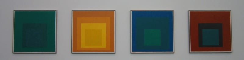
Apparently, yes, you can. Especially if color is what makes it work. Josef Albers began the Homage to the Square series in 1950 and kept going until 1976, the year he died. They are all paintings of squares inside other squares, in an experiment that feels a bit like The Hunger Games or the battle royale mode in online games: all the colors locked in one room, and let’s see what happens. It sounds unbelievably simple because there are no figures, wars, saints, dogs, or battles. But maybe that is exactly what makes the series so sophisticated and hypnotic: the power struggles between colors take over the whole painting.


Josef Albers (1950-1976) Homage to the Square [Painting] [Geometric abstraction] [Mostly: oil on Masonite] Works in several collections, including the Josef and Anni Albers Foundation
A yellow next to an ocher swells with pride, an orange brushed by red suddenly turns shy, a gray, if placed in the right spot, discovers it has a personality of its own. Albers spoke of “climates of color,” and in two words that phrase explains what happens in our eyes when we look at one of his Homage to the Square paintings.
But color does not have to stay inside a frame. James Turrell, for example, decided to use color outside a painting and use it to occupy as much space as possible.
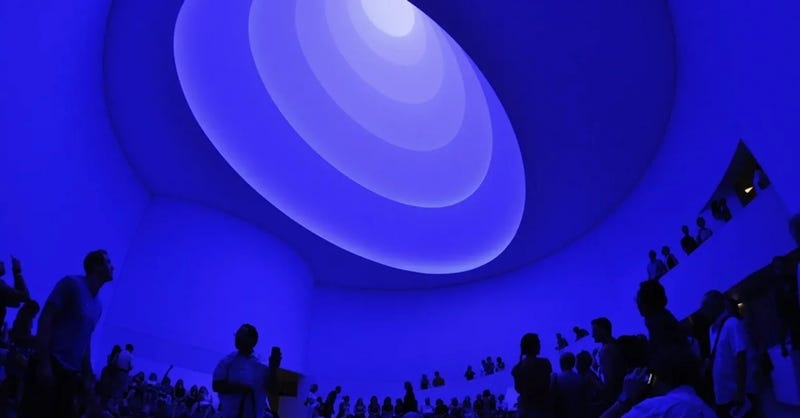
James Turrell (2013) Aten Reign [Installation] [Light art] [Light and space] Solomon R. Guggenheim Museum, New York
For a few months, at the Guggenheim in New York, Turrell transformed the museum’s famous rotunda into an optical experience. Concentric ellipses of light generating wonder. Like a close encounter with an alien culture.
Walking into a work like this means accepting that, for a few minutes, the rules of space will behave differently. As happens in other works of his too, including Aftershock just below, space loses its walls, corners, ceilings. There is no longer any depth your eye can reliably measure. Color invades everything and knocks away the points of reference we are used to. Edges soften, distances seem to stretch or shrink, and we end up inside a kind of hallucination that takes us in completely.
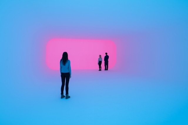
James Turrell (2024) [2021] Aftershock [Installation] [Light art] [Light and space] Copenhagen Contemporary, Copenhagen


There are video games that place a lot of importance on color. There is a Nintendo series called Splatoon, for example, where the whole point is spraying paint around. Then there is Chicory: A Colorful Tale, which we talked about in an older episode, where you have to bring color back to the world. But we need to get to the heart of the matter, so I do not want to talk about games that use color. I would rather talk about a game made entirely out of color. A game where you do not shoot, do not run, and do not save the world.
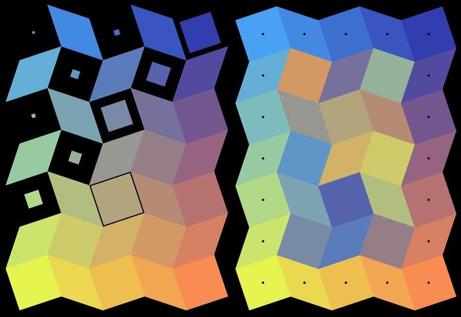
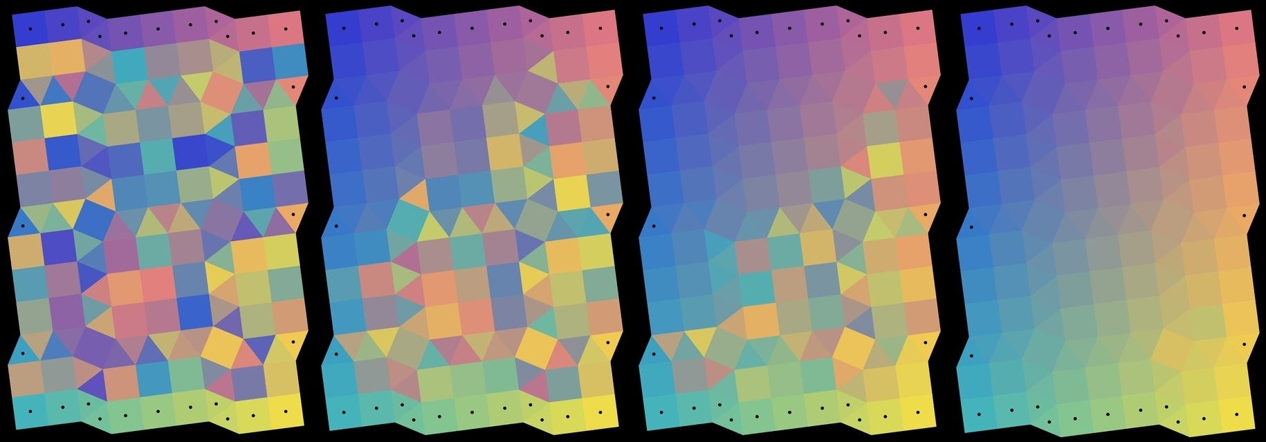
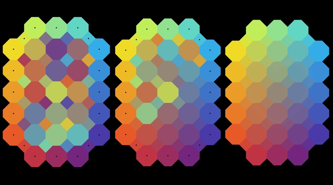
I Love Hue Too is a collection of mosaics, really an endless collection of mosaics, made of tiles that fade from one color into another.
Each level appears in perfect order, then everything gets mixed up. Thankfully, some tiles stay fixed, and with their help we have to rebuild the perfect transition from one tone to the next. That’s it.
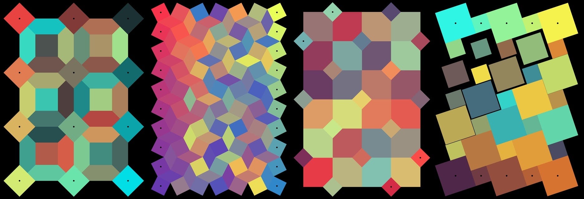
A lilac leaning a little too far toward blue, two greens that clearly have beef with each other, how did that red end up among the yellows? I Love Hue Too turns color into a truth. Finding the right tile is a small but constant pleasure, and somehow it works every single time. And in pursuit of that small pleasure, little by little, we turn into restorers cleaning up one chromatic earthquake after another, devouring one level after another.
We are not aware of it, but we are full of chromatic grammar. Traffic lights, ripe fruit, the sky changing moods, someone’s face right after reading the latest gas bill. Colors have their own way of getting into our heads. In front of one of Josef Albers’s squares or inside one of James Turrell’s transformed environments, our body reacts physically, and the brain changes with it. I Love Hue Too builds a puzzle on a language we already know without realizing we know it.
When we first find ourselves staring at a shattered mosaic, the first thought is that it must be impossible to solve. Then our fingers pick up a tile and place it exactly where it belongs. Somewhere in our heads, every color already has its perfect place: the precise point between too much and not enough.
Zut Games (2020) I Love Hue Too [Video game] [Puzzle] [Infinite] (iOs) [Android] Zut Games Ltd.
Information Desk:
Aten Reign redrew the Guggenheim in New York. In this article you can see all kinds of colors, all kinds of perspectives, all kinds of worlds.
I Love Hue Too is the sequel to I Love Hue. Who could have guessed? The people at Zut Games do know their wordplay.
After Albers, Turrell, and I Love Hue Too, even a row of macarons starts to look like a small work of art. No link this time, just a suggestion for a new pastime the next time you go to a pastry shop:


My last two coins
Sometimes I get the feeling that nobody cares about nuance anymore. Whether the subject is feelings, corn, or self-defense, everything gets hacked apart with an axe. You are either on this side or that side. Either on one team or the other. It would be like saying you can only be sad or happy. What kind of world would that be? I am never simply sad, in the sense that I never fit neatly inside the borders of that word. I am melancholy, heartbroken, low, cracked, in a bad mood. And that is only to name a few. Same goes for happiness. Not to mention that sometimes I am one shade of sad and one shade of happy at the same time. I do not know how you feel about it, but if I’m crazy, go ahead and tell me. Though I do not think I am exactly crazy. I am more dazed, alienated, visionary, senseless, odd, delirious, off-kilter. You get the idea. See you next episode, ciao!